
Skip to product information


LUTCinema LooksNo. 03
Corporate Divide LUT
Look study · 2.39 : 1Clinical whites · cool greens · flat office light
€9,99
Taxes included.
Buy 2 looks, save 15%. Buy 3 or more, save 25%. Applied automatically at checkout.
- Format
- .cube
- Works with
- Resolve · Premiere Pro · Final Cut Pro
- Delivery
- Instant download
Made by Thijs Kern, senior colorist. Graded for Nike, McDonald's, Mastercard and others.
Digital product, downloaded right after checkout. If something does not work, help is one message away.
Overview
A cool, controlled cinematic look inspired by the visual world of Severance
Corporate Divide is an original cinematic look inspired by the restrained, clinical colour world associated with Severance. Cool environmental tones, controlled saturation and clean skin-tone separation create an image that feels precise, architectural and subtly detached.
Its character comes from separation. Skin and warm practicals remain present inside cooler environments, whites retain enough neutrality to keep modern interiors believable, and the shadows carry more of the palette than the highlights. This makes the look distinctive while leaving the image readable across narrative, commercial and editorial work.
What you will notice
• Cooler architectural and environmental colour with clean, controlled neutrals.
• Restrained warm tones that remain separated from the surrounding palette.
• Denser shadows that add structure without forcing the whole image into heavy contrast.
• A quieter, more deliberate relationship between blue, green and neutral surfaces.
• A precise, slightly detached atmosphere that can remain subtle or become more pronounced through the Extra Blue variant.
How it was designed
Corporate Divide is an authored colour design rather than a film-stock reproduction. The look is built around the contrast between institutional coolness and protected warmth: environments become more controlled, while faces and selected practical sources retain enough separation to keep the image human. The palette is intentionally architectural, but it is not limited to office interiors or one genre.
The standard and Extra Blue versions provide two levels of environmental emphasis. The standard version is the more adaptable starting point. Extra Blue pushes the cooler side of the design further when the production, lighting or art direction can support a stronger statement.
Best suited for
• Narrative work with controlled interiors, modern architecture or emotionally detached spaces.
• Commercial, fashion and editorial imagery that benefits from clean cool colour and restrained warmth.
• Office, healthcare, technology and institutional environments where neutral surfaces are part of the visual design.
• Projects that need a recognisable authored palette without an aggressively baked contrast curve
Read more: Severance cinematography: how the Lumon look was built →
Specifications
What you get, and where it works.
Included
Compatibility
Next step
Pairs well with
Add a second look and save 15% on both, applied automatically at checkout.
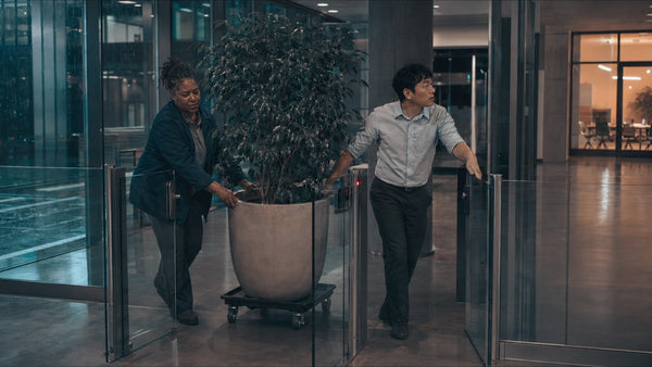 This look
Corporate Divide LUT
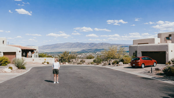
Together
Or pair it with


Reviews
No reviews for this one yet. Across the store, 4.8 out of 5 from 21 verified reviews.
Every tool here is built the same way, by the same colorist. Read the reviews of Nostalgic Film
More from Offwhitecolor
ARRI LUTs


Brand, camera and film-stock names are trademarks of their owners, used only to describe what a tool models or accepts. Offwhitecolor is not affiliated with them.